If you’re exploring color blocking interior design, you’re likely looking for practical ways to use bold contrasts and defined color zones to transform your space with confidence. This guide is designed to show you exactly how to make color blocking work in real homes—without overwhelming the room or sacrificing balance.
We break down the core principles behind effective color placement, contrast pairing, and spatial harmony so you can apply them intentionally, not just creatively. From selecting complementary palettes to defining architectural features with color, you’ll learn how to create visual impact while maintaining cohesion.
Our approach is rooted in proven design principles, trend analysis, and functional layout strategies that prioritize both style and livability. Whether you’re refreshing a single room or reimagining your entire home, this article will give you clear, actionable insights to confidently use color as a structural design tool—not just decoration.
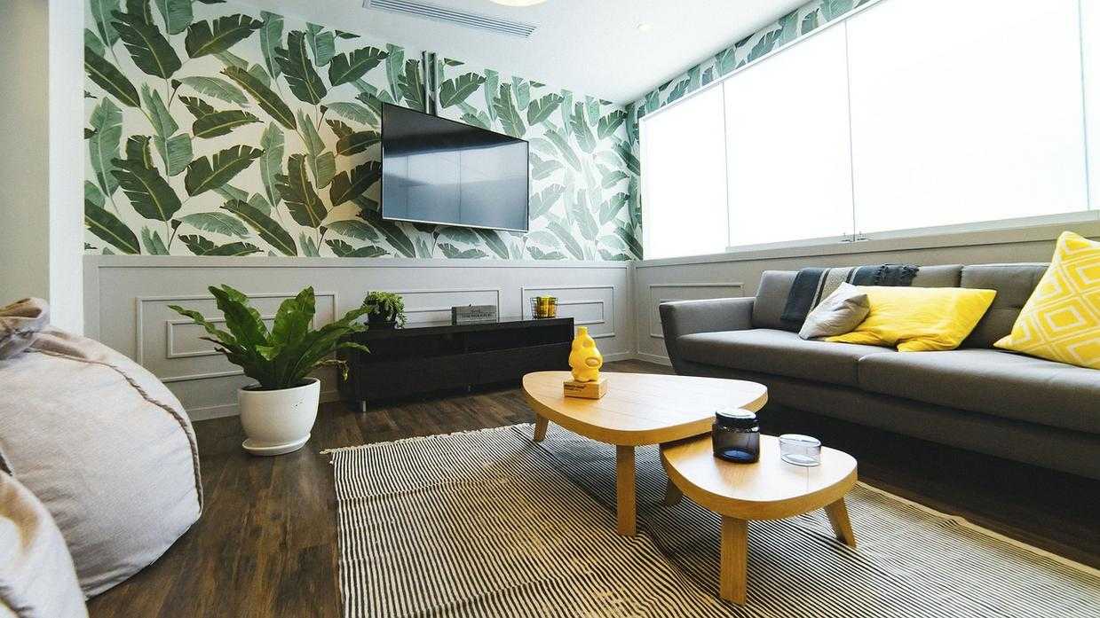
Most homeowners whisper, “What if it looks like a circus?” I hear it all the time. Yet contrast isn’t chaos; it’s intentional difference between light and dark, warm and cool tones. For example, a navy sofa against a crisp white wall instantly sharpens a living room. Meanwhile, a mustard chair beside charcoal cabinets adds drama without clutter. Designers call this color blocking interior design, but it’s simply pairing opposites with balance. “Start with one bold anchor,” a stylist told me, “then repeat it twice.” In other words, be brave—just be consistent. After all, harmony thrives on thoughtful contrast and restraint.
The Science of Sight: Why Color Contrast Works
To begin with, understanding color starts with the color wheel—a circular diagram that maps how hues relate to one another. Developed from Isaac Newton’s early light experiments (Smithsonian Magazine), the wheel helps explain why certain combinations feel harmonious while others practically vibrate off the wall. Think of it as the Spotify playlist of design: some tracks blend smoothly, others create dramatic tension.
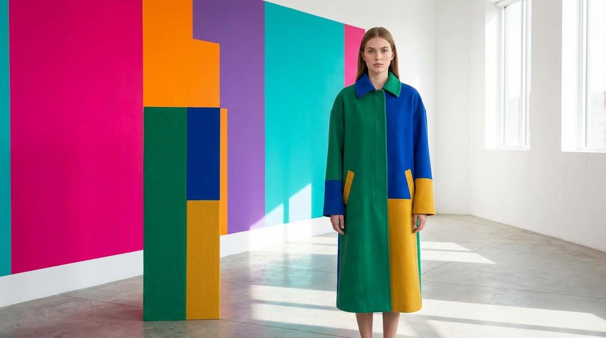
Complementary colors sit opposite each other on the wheel—blue and orange, red and green. When paired, they generate maximum visual energy because they stimulate different photoreceptors in the eye (National Institutes of Health). That’s why Superman’s suit pops and why holiday décor feels so bold. The contrast is immediate and unmistakable.
However, if that level of intensity feels like too much, split-complementary schemes offer a smarter compromise. Instead of using a color’s direct opposite, you pair it with the two hues beside its complement. The result? High contrast, less visual shouting (think blockbuster, not Michael Bay explosion).
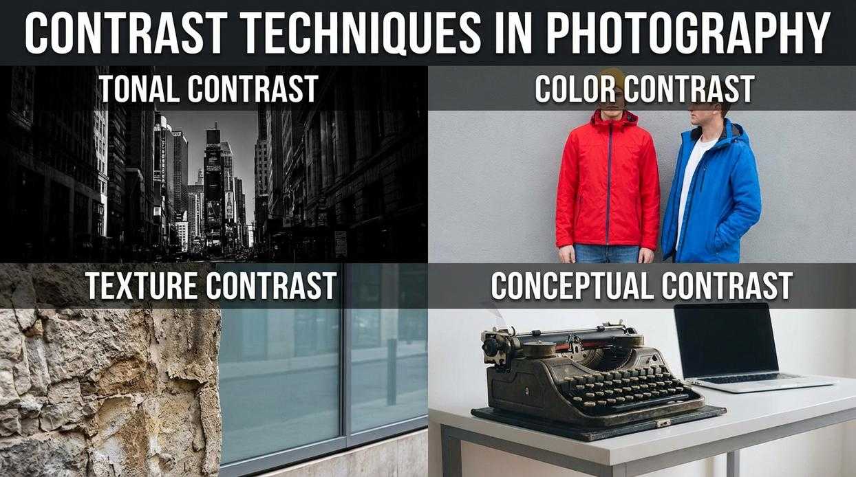
Meanwhile, tonal contrast, also called value contrast, focuses on light versus dark. A pale blue against deep navy creates drama without changing hues. In color blocking interior design, this technique adds dimension and sophistication—proof that contrast isn’t just seen; it’s felt.
Achieving Perfect Balance: The 60-30-10 Color Rule
Think of the 60-30-10 color rule as a perfectly composed song. Sixty percent is the steady drumbeat, 30 percent is the melody, and 10 percent is that unexpected guitar riff that makes the whole track unforgettable. When balanced correctly, your room doesn’t just look good—it feels harmonious.
First, the 60% dominant color sets the stage. This is typically your wall color, the visual “sky” that everything else lives under. It establishes mood and cohesion, much like the background score in a film (you notice it most when it’s wrong). Soft neutrals, warm whites, or gentle grays are common because they anchor the space without overpowering it.
Next comes the 30% secondary color. Think of this as the supporting actor who steals a few scenes. It should contrast enough to create interest but still complement the dominant tone. Sofas, curtains, or rugs often carry this weight.
Finally, the 10% accent color is your exclamation point. This is where boldness lives—throw pillows, artwork, or a statement lamp. Used sparingly, it creates energy without chaos (less fireworks show, more sparkler).
For example: 60% light gray walls, 30% navy blue sofa and rug, and 10% burnt orange pillows and art. Suddenly, the room feels intentional.
Some argue strict ratios limit creativity. Fair point. But like color blocking interior design, structure actually frees you to experiment confidently. Pro tip: if unsure, test accents first—they’re easiest to swap.
For added depth, explore the art of layering textures for visual impact at home to complement your color balance beautifully.
High-Impact Techniques for Introducing Contrast
The Statement Accent Wall
First, let’s talk about the statement accent wall. Painting one wall in a bold, contrasting shade—think deep emerald against warm white—creates a focal point without overwhelming the room. It’s a classic move in color blocking interior design, where intentional contrast defines space. Some critics argue accent walls feel “very 2012 Pinterest.” Fair. But when the color is thoughtfully chosen and repeated in small accessories, it feels curated, not dated (like bringing back vinyl records the right way).
Furniture as a Centerpiece
Meanwhile, furniture can do the heavy lifting. A sapphire velvet sofa set against neutral walls instantly commands attention. It’s the Beyoncé of the room—everything else harmonizes around it. Opponents might say bold furniture limits flexibility. True, but anchoring a space with one confident piece often simplifies the rest of your decisions. Pro tip: if you’re hesitant, test boldness with a single armchair before committing to a full sofa.
Harnessing Textiles and Art
On the other hand, textiles and artwork offer contrast without permanence. A graphic rug, patterned curtains, or large-scale art can shift the mood as easily as swapping playlists. If trends change (and they always do), these elements are easier to update than paint.
Architectural Details
Finally, don’t overlook architectural details. Painting doors, window trim, or built-ins in a contrasting hue highlights craftsmanship and adds character. Some prefer keeping trim white for resale value. Yet, distinctive details often make a home memorable—like the red door in “Notting Hill,” impossible to forget.
Beyond Color: Contrast Through Texture and Material
Contrast isn’t just about hue; it’s about feel. “When you walked in, you touched the sofa first,” a client once laughed. That’s the point. Pair a smooth leather sofa with a chunky knit throw, or lay a rough jute rug across sleek hardwood floors. Try:
- Glossy metal accents against a matte-painted wall
- Linen drapes softening exposed brick
Designers who focus only on color blocking interior design miss this tactile layer. Some argue texture complicates minimal spaces. I disagree. Texture adds quiet depth (the kind you notice at sunset). It matters most.
Your next step is simpler than you think. You now have a complete toolkit—from the color wheel to the 60-30-10 rule—to use contrast with confidence. Instead of fearing chaos, you can create intentional focal points that energize a room. Start small; for example, swap in vivid pillows or a bold print, then observe the shift. Over time, experiment with color blocking interior design to define zones. Looking ahead, it’s reasonable to speculate that higher-contrast palettes will dominate as homeowners crave personality over minimalism. Of course, trends evolve, but contrast remains a timeless tool for dynamic, balanced living spaces everywhere today.
Bring Your Space to Life with Confidence
You came here looking for clarity on how to use color blocking interior design to transform your space without overwhelming it. Now you understand how strategic contrast, intentional palettes, and balanced proportions can turn flat rooms into visually dynamic, functional environments.
If you’ve been struggling with bland walls, mismatched décor, or rooms that feel uninspired, the solution isn’t more furniture — it’s smarter color placement. When applied with purpose, bold blocks of color define zones, enhance mood, and create designer-level impact without a full renovation.
Now it’s time to take action. Start by selecting one focal wall or functional zone and experiment with a complementary color pairing. Test samples, map out clean lines, and build around your new palette with cohesive décor accents.
Ready to eliminate dull spaces for good? Explore our in-depth guides and smart styling strategies to confidently implement color blocking interior design like a pro. Thousands of design-focused readers rely on our expert-backed insights — start your transformation today and create a home that finally feels intentional.
 Décor & Functional Living Editor
Monica Hollandaverso writes the kind of prist décor and style trends content that people actually send to each other. Not because it's flashy or controversial, but because it's the sort of thing where you read it and immediately think of three people who need to see it. Monica has a talent for identifying the questions that a lot of people have but haven't quite figured out how to articulate yet — and then answering them properly.
They covers a lot of ground: Prist Décor and Style Trends, Smart Home System Integrations, Liv-Inspired Living Concepts, and plenty of adjacent territory that doesn't always get treated with the same seriousness. The consistency across all of it is a certain kind of respect for the reader. Monica doesn't assume people are stupid, and they doesn't assume they know everything either. They writes for someone who is genuinely trying to figure something out — because that's usually who's actually reading. That assumption shapes everything from how they structures an explanation to how much background they includes before getting to the point.
Beyond the practical stuff, there's something in Monica's writing that reflects a real investment in the subject — not performed enthusiasm, but the kind of sustained interest that produces insight over time. They has been paying attention to prist décor and style trends long enough that they notices things a more casual observer would miss. That depth shows up in the work in ways that are hard to fake.
Décor & Functional Living Editor
Monica Hollandaverso writes the kind of prist décor and style trends content that people actually send to each other. Not because it's flashy or controversial, but because it's the sort of thing where you read it and immediately think of three people who need to see it. Monica has a talent for identifying the questions that a lot of people have but haven't quite figured out how to articulate yet — and then answering them properly.
They covers a lot of ground: Prist Décor and Style Trends, Smart Home System Integrations, Liv-Inspired Living Concepts, and plenty of adjacent territory that doesn't always get treated with the same seriousness. The consistency across all of it is a certain kind of respect for the reader. Monica doesn't assume people are stupid, and they doesn't assume they know everything either. They writes for someone who is genuinely trying to figure something out — because that's usually who's actually reading. That assumption shapes everything from how they structures an explanation to how much background they includes before getting to the point.
Beyond the practical stuff, there's something in Monica's writing that reflects a real investment in the subject — not performed enthusiasm, but the kind of sustained interest that produces insight over time. They has been paying attention to prist décor and style trends long enough that they notices things a more casual observer would miss. That depth shows up in the work in ways that are hard to fake.